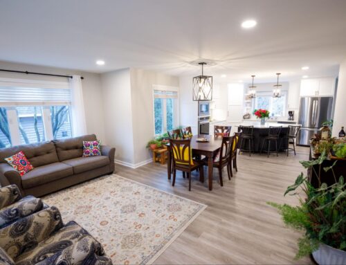
You won’t believe these before & after photos! See how our Twin Cities design team updated a 100+ year old farmhouse with a thoughtful kitchen renovation that maximizes space, storage, and functionality.
In new construction, it’s easier to get everything you want in a kitchen. After all, you have few constraints and a blank slate. But in a 100+ year old farmhouse? There are a lot more considerations and limitations. That’s where you get to see design genius at work because the style of the home at the start of renovations was a 1970 rambler – a modification from its original state.
In this Plymouth, MN kitchen remodel, our team was tasked with overhauling the kitchen. The homeowners wanted more space and storage, as well as an open, airy vibe that felt more connected to the rest of the home. Sounds simple enough…but the real challenge? They wanted to keep the vintage stone floors.
Not only did this mean we needed to be extremely cautious throughout construction to prevent scratching or cracking any of the stone. It also meant we needed to keep the perimeter layout the same (because the floors were irreplaceable).
So how do you get a bigger kitchen with better flow and function when you can’t actually make a bigger kitchen? Good design.
When you can’t expand the floor plan, you have to consider every feature of the kitchen — from cabinetry to finishes — and how they work together to maximize functionality.

In a kitchen renovation, every inch counts
Our design team loves to say, “Design is a game of inches,” and this was especially true on this project. A family who loves to entertain, these homeowners needed space for guests to hang out and mingle, not to mention enough storage and prep space to feed a family on a daily basis.
And since we couldn’t blow out walls and add extra square footage to the floorplan, we had to get creative. Luckily, our in-house interior designers are experts at using every inch of space in a kitchen renovation.
In this Plymouth, MN kitchen remodel, we used 3 design tricks to make a small kitchen feel bigger
First, we figured out how and where we could borrow some space.
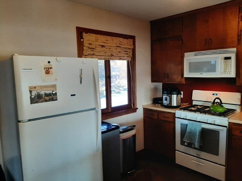
Originally, the refrigerator was floating along the wall. Not only does this look and feel unpolished, but it took up valuable floor space and blocked traffic flow. We knew we wanted to build the new fridge into the cabinetry for a streamlined look — but how?
Luckily, the home had 2 stairways to access the 2nd floor — one of which was right behind a wall in the kitchen. With the homeowner’s permission, we closed off that staircase and repurposed the space. This gave us room to add a built-in pantry and fridge wall. And in the adjacent mudroom area, left just enough space for vertical bike storage, since the homeowner was an avid bicyclist.
While the square footage inside the kitchen was technically the same, sinking the fridge and all of that pantry storage into the wall behind drastically improved the traffic flow and function of the space.

Second, we utilized custom cabinetry to maximize kitchen storage
When cabinet space is limited, customized storage inserts make all the difference. From pull-out pantry drawers to specialized storage cabinets for spices and cutting boards, this kitchen maximizes every inch.
Our design team also created shallow base cabinets for the wall under the window — where the fridge used to float. It takes up minimal floor space while dramatically increasing the kitchen’s storage and countertop space. We even created a custom open appliance garage to keep the morning coffee equipment streamlined and accessible.

Finally, we removed a wall to open up sight lines and maximize natural light
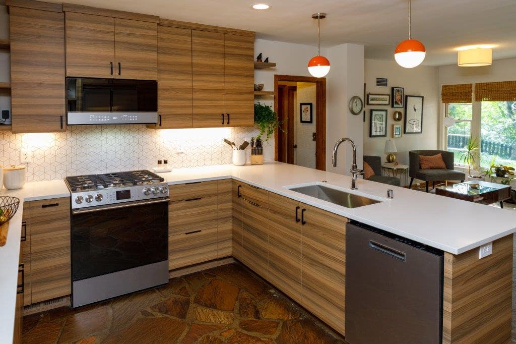
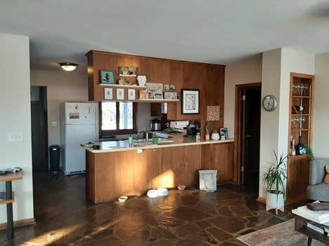
One of the best ways to make a small kitchen look and feel bigger is by opening up a wall to an adjacent room — even if it’s just the top half. Remember — in this room, we had to keep the base cabinet layout and doorways the same because we couldn’t alter the flooring. But by eliminating the upper cabinets and opening up the space between the kitchen and adjacent living room, we were able to increase the appearance of space in a major way.
The peninsula is now the ideal spot for teenagers or dinner guests to congregate — still part of the action in the kitchen, without being underfoot. And, our designers were able to tuck extra cabinetry onto the living room side of the peninsula for additional storage space.
Lastly, removing the upper cabinets means the kitchen is now flooded with natural light from 2 sides, making it much brighter and more open.

Creating an updated kitchen while honoring the past
Anytime you’re updating part of an existing home, you have to figure out how to blend the new spaces with the original ones. Here, we had to ensure that every finish and fixture fit the client’s modern design aesthetic while honoring and blending into the rest of the vintage home.
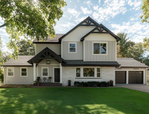
While the oldest parts of this Plymouth, MN home date back to 1900, the style of the home at the start of renovations was a 1970 rambler with some mid-century modern touches.
So, our design team found ways to bridge the gap between the original stone floors and the modern style the homeowners love. From warm walnut laminate cabinetry to the orange pendants above the sink, every detail was selected to bring the space up to date while honoring what already existed. Even the rhombus mosaic backsplash tile is clean and understated with a mid-century nod. Together, these design elements create richness, warmth, and texture — much like the weathered stone floors the family loves so much.
The cabinetry layout also includes a number of open shelves for displaying plants and decor. This breaks up the sections of darker cabinetry and gives the homeowners a place to showcase special items and art they love.
In a kitchen remodel, every detail counts.
Whether that’s visible, like fixtures and finishes, or customized cabinetry built especially for your space, each design decision plays a vital role in the overall feel and function of your kitchen.

