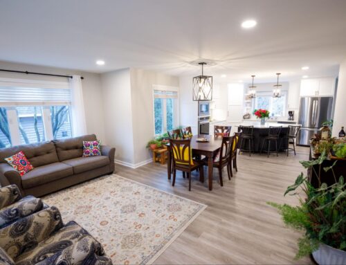
Create whole-house cohesion even if a full renovation isn’t in the budget.
In our last blog post, we shared some thoughts on the ways to effectively update your home one room at a time — to renovate within your budget while still keeping spaces unified.
And after publishing, we realized we still had a lot to say on the topic. This is one of the most important (and easily overlooked) parts of our jobs as a design-build firm: updating a space or two while keeping the whole-house design in mind.
Because the reality is: it’s much more common to update a few spaces at a time than to gut and renovate an entire home all at once.
And if you forget to zoom out and consider the big picture — how each space visually flows into the next — you can easily end up with disjointed spaces that feel like they don’t belong in the same home.
So today, our interior designers Steph Morris and Anna Gorres are weighing in on keeping your home cohesive as you update.
So how do you blend a remodeled room with the rest of your house?
First, create a master plan for your remodel.
Cohesive design doesn’t happen by accident.
In fact, the more effortless a space looks, the more careful planning likely went into each detail from the beginning. This is especially true if you’re renovating a single room.
Your master plan should not only consider the updated space, but the surrounding ones, too. Stand in various spots of the room you want to remodel and look out at your other spaces. These sight lines will help determine where to start and stop your updates, and what features and fixtures you need to consider.
At Titus, we pay close attention to every design detail, including:
- Trim, windows, doors, and other millwork
- Light fixtures, switches, and outlets
- Paint colors
- Door knobs, hinges, and cabinet hardware
- Ceiling and wall texture
This way, we can create a cohesive plan that makes each space feel connected, rather than one brand new space that sticks out like a sore thumb.
A complete master plan should include:
- Floor plans and renderings
- A mood board and inspiration images
- A detailed scope of work
It’s also helpful to include next steps and timelines. For example, if you’re remodeling your kitchen now and have plans to update your adjacent dining and living rooms in a year or two, make note of that in the plan. Even if your timeline changes, you’ll have a focused vision at the onset to keep you on track later.
My house is traditional but I want a modern kitchen. How can I blend two different styles in my home?
This type of question is common with single-room remodels. And while it’s absolutely possible to bring modern trends into your renovated rooms, it’s still important to consider the surrounding spaces.
At Titus, we like to use the illustration of “Style Buckets”. Think of design styles you’re drawn to — farmhouse, modern, traditional, etc — and give them each an assigned percentage in your design plan.
So if you really want a modern farmhouse kitchen, you could create a design with 50% modern and 30% farmhouse style, with 20% traditional touches to blend in with the surrounding spaces.
Take a look at some rooms you love — in home magazines, Instagram, or Pinterest — and see if you can identify different style choices throughout. While a room might instantly read “Farmhouse”, there are likely other styles incorporated. That thoughtful mix of styles is what gives well-designed spaces a layered, elevated feeling.
Make small changes to surrounding rooms to connect them with your updated space.

A whole-house renovation might not be in the budget, but there are likely small updates you can make to adjacent rooms to blend the old and new spaces together.
Remember the list of design details we made above?
- Trim, windows, doors, and other millwork
- Light fixtures, switches, and outlets
- Paint colors
- Door knobs, hinges, and cabinet hardware
- Ceiling and wall texture
All of these elements will help you create cohesion in your space. Here’s how you can update them thoughtfully to tie your original and updated spaces together.
Trim and millwork
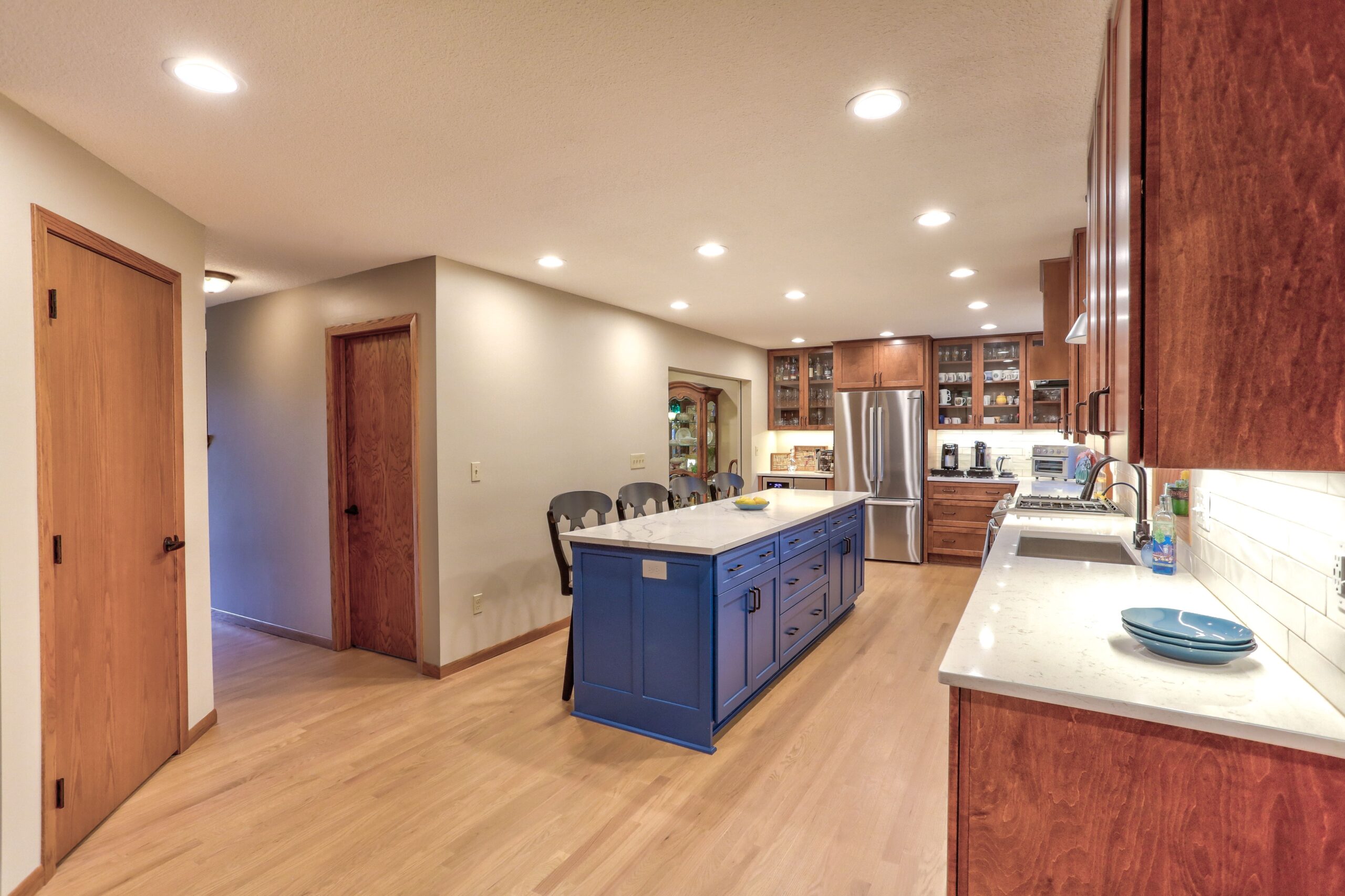
Consider painting the originals to blend in with the renovated. Painting or enameling existing woodwork is a fraction of the price of replacing it, so it’s a budget-friendly way to update your spaces.
You can even paint an adjacent bathroom vanity the same color as your new kitchen cabinets to tie the rooms together.
This is also true for fireplaces. Upgrade dated brick with a coat of paint and replace the mantle for an instant refresh.
Not in the budget to replace the mantle? Consider painting it, too. “If your home has architectural details or elements you want to hide, but removing them isn’t an option, painting them is the next best option,” our design team explains. “The darker the color, the more it will mask any ornate details.”
Many people buy homes because of the original millwork and trim details. But it can be tricky to know how to update them in a way that highlights their charm. A design professional can help guide you to make the most of every detail and highlight the best features of your home.
Light fixtures, switches, and outlets
This is a relatively quick and inexpensive fix, but it makes a huge difference. Replace dated, dingy wall plates and switches with the same color and shape as your updated spaces.
And, consider improving the function as well. Many outlets now come with USB ports for more streamlined charging for devices.
Don’t forget — lighting plays a huge role in a room’s design and overall feel. Take the time to update nearby fixtures to tie spaces together and maximize the bang for your buck.
Paint colors (plus textiles, and window treatments)
At the very least, our designers recommend giving a fresh coat of paint to adjacent spaces. “The last thing you want after investing money in a new space is for it to highlight the old one. Give nearby rooms a fresh coat for a clean, cohesive look throughout.” For a few hundred dollars, you can give an entire floor of your home a fresh, new look.
If your new space has textiles or window treatments, consider how you can bring those patterns and colors into a nearby room. For example — could the fabric on your new barstools be used on throw pillows or an ottoman in the living room?
As you look from room to room, ask yourself how you can repeat small decorative elements to bring spaces together.
Door knobs, hinges, and cabinet hardware
Another relatively small fix, but one that will make a big difference. Whenever you can, keep hardware streamlined throughout each floor of your home. This doesn’t mean it has to match, but dated, builder-grade hardware will instantly stand out when paired with clean, modern pulls and knobs.
Ceiling and wall texture
This one can be trickier because there’s a definitive line where the old and new spaces come together. If it’s not in the budget to totally eliminate your home’s popcorn ceilings, a skilled designer can help you bridge the gap between original and updated.
The same goes for flooring. Ask your designer or contractor how to seamlessly transition the flooring between spaces if you don’t plan on replacing it all. Often a cased opening provides good start-and-stop points while still giving you an open layout.
At Titus Contracting, we’re experts at blending your home’s old and new spaces. We look at your home holistically, helping not only to create the look you want, but the functionality you need for a home that feels like you.

