Find out how our design team creates timeless solutions to present challenges.
From limited space to hiding unsightly ductwork, our design team has been challenged with many design restrictions and requirements in the past year.
Not only has it pushed our team to become innovative, but it also has led to a few noteworthy creative solutions in 2021.
You know the saying design is in the details? One of our designers says “design is a game of inches, and it is in the details and inches where there is an opportunity for many design solutions.”
In this month’s blog, we explore four noteworthy design solutions thoughtfully tailored to each of our client’s unique needs.
Let’s dive in!
Design Solution #1: No space to expand? Borrow space
Our clients from the Cathedral Hill Neighborhood in St. Paul, MN, lives in a brownstone condo unit and wanted two things — a double bath vanity and more functional closet storage for the master suite.
Sounds easy enough, right? Sure is, but not when you’re limited in space.
Because these homeowners live in a condo unit and didn’t have room to expand, our design team had to get creative.
Our first step, by our experienced design team, was to ask the right questions to identify what the homeowners truly wanted and needed in their dream bathroom — and found an opportunity in unused space.
When the opportunity was found, our team developed a solution to expand the bathroom to fit a double vanity using the space that we already had.
So how do you increase space in a home that’s already maxed out in space? You borrow space where you can.
Luckily, a sauna adjacent to the bathroom wasn’t being used. Our design team took a portion of the sauna to add to the master bath and built-in double vanity. The old vanity space was then revamped to a makeup station.
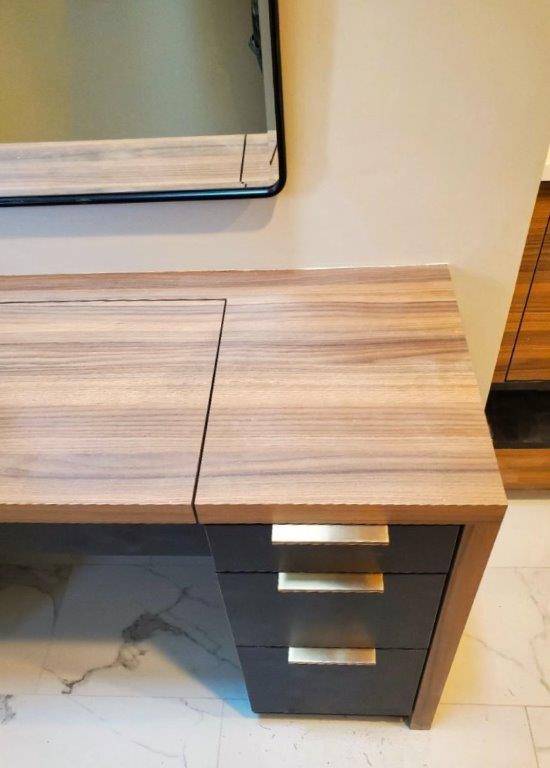
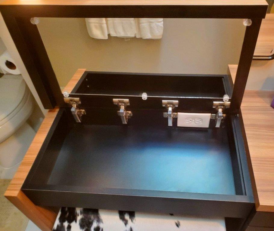
To maintain the home’s modern design, we kept the clean lines by designing cabinetry with a hinged countertop to provide more space for make-up, a mirror, and even an outlet for getting ready. With the borrowed space from the sauna, our clients can now enjoy getting ready at the comfort of their own vanity with convenient and organized storage.
Along with their double vanity, our St.Paul clients wanted a more functional closet for storage in their master suite.
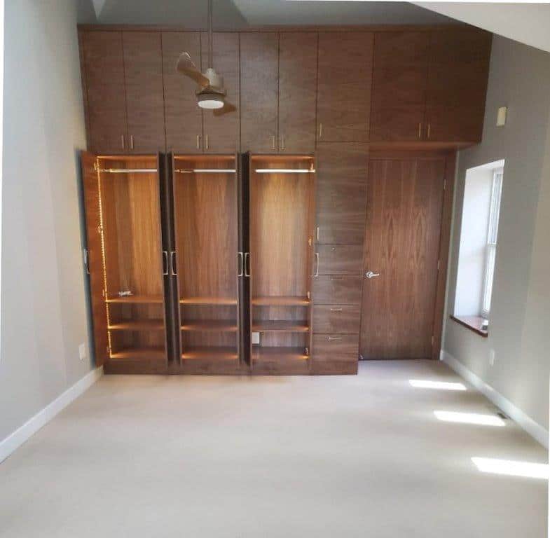
Since a walk-in closet wasn’t an option, we decided to add cabinetry. It was an excellent opportunity to add interest and character to the master suite versus a standard door into another space.
The walnut dresser in the first image is what drove the custom, real walnut closets to be made. Not only did we gain beautiful storage, but it also mimicked the mid-century client’s style — while adding a level of warmth and sophisticated beauty to the space. The slab-style doors added a modern feel allowing the horizontal wood grain to be the focal of the room.
To increase storage and functionality of the closet space even more, we borrowed space above the cabinets and built upwards, pulling the cabinetry to the ceiling (see image). By adding pull-down rods, the homeowners can easily access their clothes (without a stool) — when getting dressed in the morning or putting away their laundry. For added built-in organization, shelves were added underneath to house smaller items.
Design Solution #2: Can’t remove it? Design around it
What do you picture when you hear combo laundry and mudroom?
If you’re thinking of lots of clothes, muddy boots by clean whites, heavy foot traffic, and some ductwork, then you’re right.
That’s what most mudrooms and laundry rooms end up looking like without proper systems in place and it’s exactly what our client from Maple Grove wanted to avoid.
Our client wanted their most frequently used combo laundry and mudroom to have maximum storage and look organized and aesthetic all year round.
Since the space had three doorways, it meant a lot of foot traffic, and lots of space had to be dedicated to clearance paths, making the room organization and easy to put away clutter critical for these homeowners.
With a good amount of space allocated to circulation paths, our cabinetry design needed to provide maximum storage — keeping the walkway clear and streamlined. At the same time, the plumbing and ductwork needed to be strategically hidden to elevate the room’s aesthetic.
So how do you hide bulky ductwork while maximizing space? Clever design.
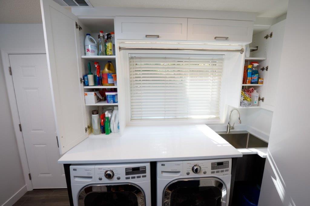
Our team designed laundry storage cabinets to wrap around the plumbing to 1) hide unsightly ductwork while 2) increasing storage for laundry and cleaning products.
Within the cabinets, adjustable shelves were added to provide homeowners the flexibility to customize their storage. And in between the cabinetry, we added a rod at the window opening to maximize space making every inch count.
The laundry machines are tucked underneath the cabinetry to maximize clearance path and make doing laundry a breeze, with cleaning essentials available at arm’s reach.
Instead of a typical locker system for mudroom storage, our team opted for 30” deep closed storage cabinets.
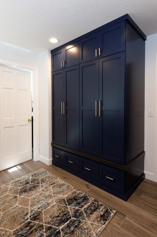
The cabinets were designed to be extra deep to provide more storage space for outerwear and laundry items. The drawers were added below for a more ergonomic storage option and additional organization.
To tie the room together, the full-height cabinet and the laundry surround were both painted navy blue. While the counter-to-ceiling cabinets were painted white, leaving the room light and bright, making it feel more spacious and open — a must for a busy room.
Design Solution #3: No space to borrow? Get savvy with your materials
A pantry is an essential for any kitchen remodel, whether the pantry is a step-in, walk-in, or cabinet-style.
It was no different for one of our clients in Lauderdale, MN. The challenge was to fit a dining room, kitchen, and pantry into a 10×20 ft space.
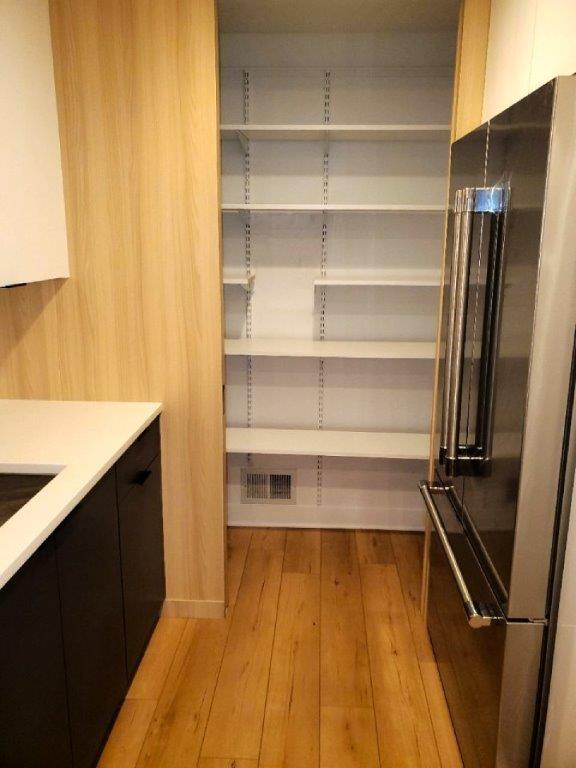
How can we maximize space for the small pantry with the kitchen and dining room taking up most of the space? Use materials in an innovative way.
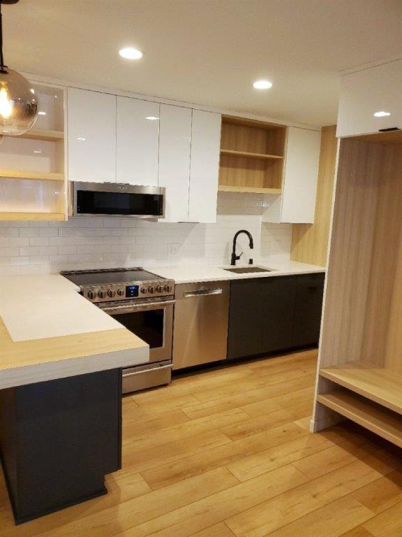
Our design team decided to opt out of the standard framed wall pantry. Instead, we decided to use cabinetry material to build the pantry, including the pocket sliding door to give the kitchen an extra 2” of space — which is plenty of room in a 10×20 ft space.
To heighten the modern design appeal of the kitchen, we went with a wall-clad vertical grain wood veneer, which was an element used in other areas of the space. As a result, it felt more like cabinetry and a design element rather than an add-on pantry.
Design Solution #4: Using pockets of space to complement your day-to-day life
Great interior design goes beyond designing a beautiful space — the space has to be designed to complement your lifestyle. As most of our projects do, this project follows our design philosophy “function, form, feeling & facts.”
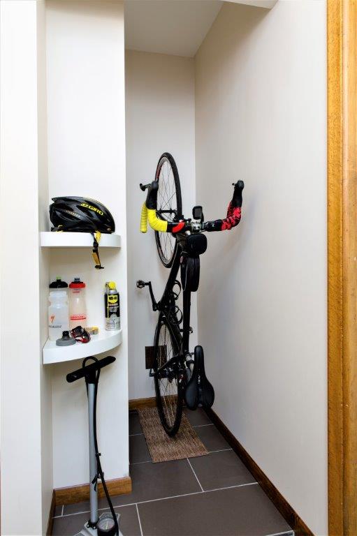
A client of ours from a kitchen remodel had extra space left, and he was an avid cyclist. So, we had the opportunity to make the space truly unique to him.
Like the solution earlier on ‘borrowed space,’ our clients for this project had two staircases to the lower level — one of which was right behind a wall in the kitchen. We identified this area to provide more function and flow to the kitchen as it was the perfect place to house tall and deep items like a refrigerator and built-in pantry. After allocating enough space for the kitchen, there was still extra space available.
Because of the extra area, a “bonus” room — adjacent to the front entry and the main side entrance — became another opportunity to customize the space to our client’s day-to-day activities.
The extra space was converted to a vertical bike storage locker, and our client no longer needs to store his bike in the front entrance. Now, it’s tucked away, protected from the elements, and easily accessible, along with additional storage for biking accessories.
No matter what room you want to remodel, every inch and detail matters.
Whether your remodel is limited by square footage or unsightly ductwork, there is always a design solution to bring your vision to life.


